Sunday, March 26, 2006

Conclusion (Evaluation)

This is the final post for this project. This post has contributions from Dan and Mark.


Following the User Centered Design (UCD) principles as closely as possible we have found them to be an effective way of creating new products of any sort in a manner that allows changes to be made easily and without the hindrances of typical engineering methods such as the waterfall method.


During the project we sought stake-holders and:

* Held a meeting with one of them (as this was the maximum number we could reach) and discussed the feasibility of the project

* Mapped out (and continually updated) the requirements of the device based on stake-holder input

* Designed the prototype

After designing the prototype we returned to our stake-holder with a presentation of our prototype and went from this to conduct usability testing out in the field where the device would be used. This testing shed the light on our design's good points, bad points and points that needed to be changed. This has been shown in previous posts.

After making the necessary changes identified in our design we attempted contact with a more general audience. We found it very difficult gaining their participation in this with only one group replying. We felt it best to get a general overview of our idea from the groups and the feedback on our ideas was very positive with the only issue raised being should this device come to the market it would need to be at an affordable price.

In conclusion, we have experienced both the pitfalls and the successes of working as a team following the UCD method to design a system to help a specific audience complete a specific task. The project did not always proceed as smoothly as hoped, due to delays in trying to contact and waiting for responses from our stake-holders. We found it very effective to use the UCD method to find out exactly what our target users require of the system, and some lateral thinking within the group was quickly able to resolve all the issues that arose from the evaluations performed. The final product met with approval from genuine 'real-world' potential users and, given the funding, we believe it could realistically be still further developed into a real system.

Friday, March 24, 2006

Success!

After contacting a small number of blind groups, a member of the Birmingham Focus on Blindness group was kind enough to reply to our email.

As mentioned previously the email I sent out was very much the same email Mark sent to Peter White. Posted below is the reply I received, all contact details have been removed (and replaced with a [cut]) for the purposes of upholding user privacy.

The reply is from Stuart James


Hi,

Like the sound of the project very much. There are some well thought our
solutions. Particularly like the watch and earpiece idea. Have you thought of
the military applications that could make your fortune?

If you would like to arrange a demo to a selected audience of blind or visually
impaired people then please contact us again - either myself or Will Thornton.
Email us at [cut] or [cut] or ring [cut] and ask.

One word of warning though, beware the cost! The majority of VI people are
unemployed and simply won't be able to afford high cost technolohy.

Regards

Stuart

-----Original Message-----
From: [cut]
Sent: 22 March 2006 21:10
To: Stuart James
Subject: Requesting your help on a future access technology


Dear Stuart,

My name is Daniel Trimm and I'm a student at the University of Birmingham,
studying a course in Computer Science.

I am in a team of three students who have taken up the challenge of
developing an electronic personal guidance and assistance device for blind
and visually-impaired people. We have almost completed the design of our
device but we require feedback from those who are most likely to find it
useful, and so we decided to get in touch with you.

In brief the device takes the form of a smart watch and bluetooth headset,
both connected wirelessly to a pocket-sized processing unit. We decided to
tackle the tasks of guiding a user around an outdoor environment such as an
unfamiliar town centre, as well as localised indoor environments such as
supermarkets, using a GPS system such as the Galileo system being launched
by Europe at the moment.

We designed the device to be controlled using the smart watch, which has a
rotating bezel to scroll up and down menu items in a similar way to the
iPod click wheel, and buttons to go back and forward in menus. Menu items
are spoken through the headset. Shopping lists for a supermarket or travel
itineraries for a day in town can be created on the user's PC and
downloaded to the central processing unit, although there is no requirement
for pre-planning your day as you can use the smart watch to locate specific
places or items once you're out in the field too.

The smart watch guides the user using a ring of pressure pins underneath,
pressed against the user's skin, corresponding to points of the compass. As
the user moves around, the active (pressed) pins also move to guide the
user around corners to the destination. Voice prompts can be given through
the headset to assist in this too.

GPS overlays giving more information about the user's surrounding area,
such as the location of aisles and checkouts in a supermarket, or bus stops
and other public locations in the town, are downloaded automatically by the
device to give more information to the GPS route finding system. Items in
the supermarket can be identified by firstly going to the correct aisle
using the directions from the smart watch GPS system, which makes use of an
overlay provided by the supermarket containing details of which aisles
contain which items. A hand-held barcode scanner provided by the
supermarket then gives the user information on the product they are
curretnly holding, so they can determine if it's the product they need.


The journal of our development process, including all our thoughts on the
device, can be seen at http://hci2msd.blogspot.com
If you could be so kind
as to let us know any thoughts or comments you have on our device design,
that would be appreciated very much and would help us to refine the design
for future users.

Thank you for your time.
Regards,

Daniel Trimm

Wednesday, March 22, 2006

A last attempt to get people to evaluate our project!

Just a quick post,

This evening I have made a final attempt (on my behalf) to try and get people to evaluate our project...

I found a website (http://www.echurch-uk.org/links/societies.php) and I have contacted several societies on it in an attempt to get them to help us out with evaluating our product.

Hopefully some of them will help us out!

Wrapping this post up, just thought I'd say I used a slightly altered version of Mark's brilliant email to Peter White to contact these groups.

Help! We need some bodies

One of THE most difficult parts of this project has been finding people to help us design it, now its proving even harder to find people to help is evaluate it!. If you know anyone that could help it would be appreciated if you could send them our way!

Tuesday, March 21, 2006

Summing up our new findings 2

Carrying on with the story...

My second thought for the device is regarding the 'Use By' and 'Best Before' dates on products. Admittedly we never thought about this in the original design of the menu system and information system (shocking really, I used to work in a supermarket and had to keep the legal documents for this bit!) but I have been thinking about this today and I can quickly see a problem...this information isn't exactly readable by a barcode scanner!

I have thought of a way around this. Currently products that require this information have the date printed on them and in supermarkets, items which are tagged with barcodes printed in-store that have prices which change with each individual item (such as reduced items) tend to have the price hidden within the barcode (once you see enough of them, you soon realise which sections of these barcodes state the item is reduced, state which department it was reduced by and its new price) and this could be easily incorporated into a small barcode located close to the main barcode that contains the products 'Use By' or 'Best Before' date. Products that don't require this sort of information could be given a 'NULL' tag.

This would cure this problem with ease and would cost hardly anything to implement. My final comments on barcodes considers their location on products. I personally believe that it would be simple to replace current barcodes with a barcode 'ring' which repeats itself all around the product. This could either replace current barcodes or it could be developed as a special barcode just recognised by the Brain and I believe manufactures would not mind implementing the ideas here in the face of all of them making the same modifications in their packaging which could increase sales as blind users will have easier access to automatically finding our about new products due to the proposed methods of product location and identification.

Summing up our new findings

As promised, today I will make a few posts.

This post is dedicated to summing up our new findings when we tested with Mike. I won't regurgitate what Mark posted but instead add my own thoughts to this.

The first thing that stands out in my mind as an issue is the system's level of detail that it gives to the user. We quickly discovered that what we thought would be 'the norm' information for users isn't always going to be what they want and we should therefore revise how this section of the system works. Personally I believe the system should be revised as follows:

Within the settings menu there should be a set of fields which can be turned on and off and these would contain various topics of information such as "Product Weight" and "Nutritional Information" which can be turned on and off as the user requires. This settings menu should be peripheral device specific and not store/location specific because users will tend to want the same settings when using that particular device more than their current location because the peripheral devices will tend to be activity orientated and as such are barcode the barcode reader settings used at one supermarket will almost certainly want to be used in other supermarkets.

Further to what I have just said, there will need to be a 'standard' set of information that all supermarkets provide to the system for this information section. This information is very much standard already across all supermarket firms as all have pretty much the same information in their barcode databases thanks to the standardisation of barcodes (they follow the Universal Product Code, see http://www.av1611.org/666/barcode.html for more information) and software for such system being of a more generic industry setup rather than tailored for each individual company. The system could include a number of fields that are specific to the company/store they are visiting but I would limit this (to say 4) as companies may go 'overboard' if given too much leg room.

Another feature this section of the system will need is the recognition of different types of store, for example, nutritional information is hardly useful when you are looking for a new door bell at your local DIY store (a British term for your local hardware store, if DIY confuses you). Also, at such a store, getting more information about products (such as product dimensions) is very important and all these different fields would make a settings menu list that is laid out the same way as the IPod list huge and extremely difficult to navigate. I therefore suggest that using an idea taken from barcodes, different types of store are standardised in a store type ID database, built into the Brain which then makes a request to the device (such as the bar code scanner) when they are pairing as to what type of store is it in. From this the Brain can customise the information settings menu. With a finite number of types of store the Brain can store each individual menu setup and after the initial configuration of each menu, every time in encounters that store type it could just restore that store type information settings for the Brain to use and for the user to customise as they see fit. Finishing this, when linking the Brain with a PC the computer software for the device can allow the user to see all the settings at once so they can quickly setup all the menus on their new device before they leave the house.

At this point I will start a new post...

Monday, March 20, 2006

Copy of a letter sent to Peter White of In Touch, a Radio 4 show for disabled listeners

Dear Peter and the In Touch team,
My name is Mark Rowan and I'm a student at the University of Birmingham, studying a course in Computer Science.

I am in a team of three students who have taken up the challenge of developing an electronic personal guidance and assistance device for blind and visually-impaired people. We have almost completed the design of our device but we require feedback from those who are most likely to find it useful, and so we decided to get in touch with you.

Briefly the device takes the form of a smart watch and bluetooth headset, both connected wirelessly to a pocket-sized processing unit. We decided to tackle the tasks of guiding a user around an outdoor environment such as an unfamiliar town centre, as well as localised indoor environments such as supermarkets, using a GPS system such as the Galileo system being launched by Europe at the moment.

We designed the device to be controlled using the smart watch, which has a rotating bezel to scroll up and down menu items in a similar way to the iPod click wheel, and buttons to go back and forward in menus. Menu items are spoken through the headset. Shopping lists for a supermarket or travel itineraries for a day in town can be created on the user's PC and downloaded to the central processing unit, although there is no requirement for pre-planning your day as you can use the smart watch to locate specific places or items once you're out in the field too.

The smart watch guides the user using a ring of pressure pins underneath, pressed against the user's skin, corresponding to points of the compass. As the user moves around, the active (pressed) pins also move to guide the user around corners to the destination. Voice prompts can be given through the headset to assist in this too.

GPS overlays giving more information about the user's surrounding area, such as the location of aisles and checkouts in a supermarket, or bus stops and other public locations in the town, are downloaded automatically by the device to give more information to the GPS route finding system. Items in the supermarket can be identified by firstly going to the correct aisle using the directions from the smart watch GPS system, which makes use of an overlay provided by the supermarket containing details of which aisles contain which items. A hand-held barcode scanner provided by the supermarket then gives the user information on the product they are curretnly holding, so they can determine if it's the product they need.


The journal of our development process, including all our thoughts on the device, can be seen at http://hci2msd.blogspot.com If you could be so kind as to let us know any thoughts or comments you have on our device design, that would be appreciated very much and would help us to refine the design for future users.

Thank you for your time.
Regards,
Mark Rowan.

Sunday, March 19, 2006

Explaining the lack of posts

Sorry to all for the lack of posts this week but dissertations have got in the way... My next post will definitely be on Tuesday when I add my bit to the evaluation of the test we conducted with Mike and further Mark's suggestions of what needs to be changed in our current prototype. I will also look into evaluating further the technologies that are aimed at driving this device.

Though I have been busy this week, I have made some progress on this. I have contacted the RNIB business development group to seek their help and I have sought after online forums in the hope that both groups may be able to help us with feedback on this device.

For now I leave you with something interesting I found, Linux being ported for use by blind users at: http://leb.net/blinux/

Thursday, March 16, 2006

RFID virus concerns

The BBC is running a report on its technology site about RFID tag viruses. The report describes how some RFID tags, with their embedded microprocessors, could be used to run malicious code and spread via radio to other nearby tags, and so on.

Of course, being aimed at the non-technically-literate, the report warns of the impending doom of an uprising of new breeds of mutated virii (or 'viruses' as the BBC calls them) - in a similar way to the mutating H5N1 human-bird-flu pandemic that we're all supposed to be expecting - that will cause havoc across the nation.. when in reality, the original research was actually an attempt to warn RFID makers to secure up their systems.

Still, now that RFID tags are back on the cards for our system, it would be worth bearing in mind that with current less-secure tags, you may not always be able to trust the data that you're receiving from them (and if you're blind and can't tell the difference between two items without the RFID being correct, this is a real problem).

Changes to be made

What follows is a very brief summary of the aspects of the system our testing showed need to be changed, or that should be added:

The ability to warn the user using voice prompts in the headset about upcoming hazards eg. the turnstile at the entrance to Pronto. These can be included on the local area overlays as 'hazard areas' along with the text which will be spoken by the Jaws software on the brain of the device when the user enters one of these areas.

Guidance to specific shelves using RFID tags embedded into each shelf containing a description of what items are on this shelf. The device brain could read the RFID tags to tell the user which shelf (numbered sequentially from the floor or from the top, for example) the desired item is on.

Currently the user has to pick up the item and turn it around when looking for a barcode to scan it and obtain information on what the item is. This is somewhat cumbersome for a blind user, and wasn't tested in this session (the product details were read straight to him when Mike pointed at it). One way around this would be to use larger barcodes such as those on Aldi branded packaging. However manufacturers are unlikely to adopt this industry-wide as it can be seen to detract from the aesthetics of the packaging. Another possible remedy is for the item barcodes to also be stuck to the shelf in front of where the item is stocked, so that it can easily be read by the barcode reader.

Wednesday, March 15, 2006

Testing the system

Last Wednesday we took Mike Sharkey around the Pronto supermarket in the Guild to test our system. It is important to note that Mike is unfamiliar with the layout of this shop, so we believe that there is no chance of the results of the guidance system test being skewed by him already knowing his way around.

Before he arrived for our prototyping session I walked around the store and planned a list of items to be bought, along with a route that would efficiently take him past their locations. This was done in advance as in the completed system a shopping list would be downloaded to the device by the user and then an optimal route for these items automatically computed once the layout of the shop is downloaded to the device upon entering the shop.

For the purposes of the experiment I took on the role of being the system, giving out only as much information to Mike as the system would allow in normal usage, and only when requested by the user (so I wasn't just giving him unneccessary help). For this experiment Mike asked me verbally for information rather than pressing buttons on the smart watch. Mike was allowed to query Dan and Smirf for advice on how to use the system, so we could help him whilst still drawing a distinction between what the system (me) said and the advice given by Dan and Smirf.

The items chosen were:

  • a Ginsters bacon lettuce and tomato sandwich
  • a pack of McCoy's salt and vinegar crisps
  • Evian mineral water
  • a tube of Jaffa Cakes


The first thing that we noticed on entering the store was the (adimttedly unusual) turnstile in the entrance which Mike didn't know was present and the system didn't warn him about, leading to him banging into it.

Mike requested the first item on the shopping list, which was read to him as 'Bacon, lettuce and tomato sandwich' followed by an instruction that the item was ahead of him, simulating the directional guidance given by the pressure pins on the back of the smart watch.

Guiding him to the correct aisle was pleasantly straightforward as Mike was able to use the prompts from the system to aid him in navigating in his usual way with his cane. My voice prompts were given only at key points of the guidance such as corners between aisles, but the pressure pin system would be able to give continual guidance, which should avoid any confusion that arose from me giving incorrectly-timed instructions. An example of this was when locating the McCoy's crisps and I told him the item was on his right about 2 paces too early so he stopped. The system would have been more accurate than me anyway thanks to the localised GPS, but if Mike had stopped too early to reach the crisps the pressure pins system would still be telling him that the crisps were ahead of him so this confusion would have been avoided.

Mike initially struggled to locate the items using the 'barcode scanner' (me reading the names of items as he pointed at them) once he'd reached the correct area of shelves. We realised that our previously-discussed idea of using RFID tags may still come in useful here, but to identify to the system at a glance what items are on a particular shelf rather than broadcasting from a tag for each item individually.

One of the items (the mineral water) was on special offer in Pronto. The system would be aware of this thanks to the database of product information accessed by the barcode reader, and so I announced to Mike once he'd scanned the mineral water that 'there is a special offer on this item'. He then, without prompting, asked for more information (equivalent to pressing a button on the smart watch) which shows that the system seemed intuitive enough for him to know what to do in that situation. The ability to announce special offers in this way should benefit both the store and the customer, as the store is more likely to sell more items if the customer's attention is drawn to the offer, and the customer gets t save some money.

On the topic of information that the system announces to the user, we had a hard time trying to strike a balance of what information should be spoken to Mike when he 'scanned the barcode' of an item and requested detailled information. At first he told us it would be useful to know the sell-by date of an item of food which was a good point, so I added this into my product summary. He didn't seem to want to know other data I offered, such as the weight of the packet of crisps. However to be fair, inclusion of this data into the product database is all up to the shop stock manager so we would only be able to make recommendations as to what data should be included. Supermarkets could do their own research to find out what data their customers most require from individual items.

After the final item was located and collected, Mike requested directions to the checkout from the system. This wouldn't strictly be necessary in practice as by selecting the 'next item' menu option from the smart watch, if the shopping list is exhausted it would give him directions to the checkout anyway.

In total, from entering the shop to leaving it, took just under 4.5 minutes for four items of shopping. This may seem slow in an uncrowded small supermarket for an average sighted person, but we were not aiming to match the speed of a sighted shopper. Mike mentioned to us at the end of the session that actually he'd quite often have to wait for at least that long before someone would be available to help him if he requested assistance, so efficiency of the system appears to be a very positive point.

Friday, March 10, 2006

Video of prototyping

Just a quick note to point out that a video of the prototyping session with Mike is available at http://www.fukmi.co.uk/~mark/100_0116.avi

There is also a longer audio-only recording from the dictaphone at http://www.fukmi.co.uk/~dan/hci2/hci2.mp3 including Mike's responses and feedback at the end of the session.

More analysis will follow.

The ways we have gone about things, why made the decisions we did and the problems we have encountered

As I sit here at 1:55 AM after spending hours tinkering with my Final Year Project (and making another discovery) I have two sets of thoughts churning through my head which I am trying to clear up so I can go to bed:

a) My sister and Dad (my Mum isn't going due to her disliking of long haul flights) are flying to New Zealand for a few weeks at 6:00am for my cousins wedding... Why didn't I take a gap year?!? - Guess I'll just have to make up for this next year on my travels.

b) The problems we have discovered doing this HCI project.

As the latter is much more relevant, I shall concentrate on it.

First off I think it's important I explain why we have done some things. As computer scientists (and researchers) it may seem that we have focused quite heavily on the core technologies of our idea and not on the abstractness of the problem and there is a reason for this. When we set out to do this task one of the first decisions we made (unconsciously at first, then it hit home after our first interview with Mike) was the importance of modeling this project on existing tried and tested technologies, we had three reason for doing this:

  • We couldn't ever have a full idea of the needs of blind users so using technology they already understood and liked was a must and we quickly discovered that training in a new technology is a slow process for many blind people so avoiding this was a high priority.
  • Our ideas from the beginning focused around making a new and different use for existing technologies and this helped because our idea was so big and general that making everything out of 'concept' ideas would have made it an impossible task in the time allocated.
  • A lot of existing technologies are either at, or are quickly reaching, the levels of efficiency and ability where this sort of project will be feasible in the near future
The abstract components of our project can be seen to be encapsulated in our technology work through what needs to be different and how we think tasks should be approached.

You may also notice we do not have any spectacular drawings of menus and uses, these would be pretty useless in a system meant for the blind! Our work concentrates on their environment and what works for them.

So what about the problems we have encountered? Well the biggest has been testing audience, Mike has been absolutely amazing in helping us out but sadly surging a big pool of volunteers that could help us in a way that would be useful for this task is a very hard thing to do and so we have had to rely pretty much solely on Mike, so far our attempts to contact people who could help us, including those who have publicly said about such a system being needed without ever talking, meeting us or seeing our work have ended in no replies but hopefully we can get a little bit more luck now after we conducted a live demo Wednesday (we'll blog what happened as soon as we have collated it all).

Have we been hit with other problems? Well yes, trying to anticipate blind users needs in a concept system is quite difficult and without throwing lots of money at organisations set-up to help the blind, getting their easy to understand guidance is very hard, so apart from Mikes feedback at our ideas and stuff we have ideas from previously we have been working on a lot of the projects design thoughts in the dark, again with no major feedback mechanism to tell us when we're getting it right and when we're absolutely wrong.

Well it's almost 2:30 now, I'll get another telling off by my medic housemate for being up late and getting up early (whilst recovering from illness). She is right for doing so though...

Wednesday, March 08, 2006

Companies get help building websites for disabled users

This has been a long time coming but now its here perhaps companies that build websites will start using their heads and force the web designing community which has spent for too much time making websites flash in the last 10 years and not practical to wake up and give everyone access.

So what is it? Well it's called PAS 78, it's a set of guidelines developed to help companies comply with laws developed in the UK in 1999. The law states that UK companies with a public accessible face on the Internet are obliged to provide access to everyone, including disabled users.

PAS 78 has been developed to help anyone looking to build a disabled user friendly website with the 78 key things they need to get their site to work with pretty much all disabled equipment available for computers.

More information is available at: http://news.bbc.co.uk/1/hi/technology/4783686.stm

Prototyping the system

Clearly, given our target audience, we can't produce a visual prototype to show potential users and ask for feedback. After a bit of thinking we've come up with an alternative involving us simulating the device's voice prompts whilst a user requests information from us as they would do with the device. This can then be recorded using a video camera and analysed later.

Mike Sharkey has agreed to be our guinea pig for this test. Firstly we will obtain a shopping list of his items in advance so we can actually go to the store and plan a route around the shop floor (analogous to the route finder in the system producing an itinerary from a pre-defined shopping list).

Once permission has been obtained from the store (most likely Pronto in the Guild or University Centre) the following test plan will take place:

Testing to see how well the suggested menu system with rotating bezel works

  • give Mike an overview of what's available in the menu system in terms of options
  • see if he's comfortable clicking round and selecting items from it with us providing voice feedback of the current menu item.
  • record audio feedback from him about how he found it.


Once he's happy (or not) we can move onto simulating the actual tasks without the "clicking", just him telling us what he wants to achieve eg. "go to checkout" and we will then guide him.

Guidance
Clearly we can't simulate the pressure ring on the back of the smart watch, so we will use voice commands, eg. "left", "stop". Afterwards we will ask if he thinks the pressure system specified would be better than our improvised voice prompts.

Shopping - repeat:

  • Mike should ask us what item he's looking for from his list (which we hold).
  • tell him (by voice) compass directions to the item's shelf, and when to stop.
  • Mike should then emulate using the barcode scanner to check the (imagined) barcodes on the shelves.
  • he should move his finger, pointing from the top to bottom of the shelves, scanning from top to bottom, with us reading out the product description as each shelf is reached. This is equivalent to the user scanning down the shelves with the barcode reader.
  • he should say "that's it" or something similar when he's happy with the choice, then retrieve the next item from us (the list) by saying "next item"
  • at the end of the list we say "end of list"


Product description should give a succinct summary of manufacturer (eg. Heinz), item name (baked beans), weight/contents if necessary or multipack etc. In practice this will all be set by the supermarket but we should be careful not to give too much (due to taking too long and the user getting impatient) or too little information.

I suggest we should choose just three or four items for Mike to locate using the simulated system and record him using the video camera doing this to see if it seems straightforward enough for him to use, and whether he improves in using this system by the end of the test.

Finally we need to ask him to discuss with us how he found the overall experience, recording it as audio on the camera. We should specifically cover ease of navigation - "does it get you to what you want quickly enough?"

Tuesday, March 07, 2006

Ethics

Many on the ethical issues attached to this project are the same as those attached to a loyalty card for supermarkets in that a store can obtain details on your shopping habits and use this to agressively market products at a user. While in most cases you can opt out of having a loyalty card with little impact opting out, the device that we have design has greater dependancy than a loyalty card thus it makes an opt out policy quite difficult, leaving the only options to either look for ways to enforce legally data protection of the users of the device or design the system in a way that the supermarket cannot actually access the shopping list data themselves but this added's complications to the device.

Exspansion on the barcode reader

Glad I actually put this off until we had that talk on skype because it brought some more points to the surface's.

In other posts we've discussed some of the main constraints behind the barcode scanner in that it would be best if the scanner was owned and maintained by the supermarket, this is primarily to do with the fact that most supermarkets would not like there complete stock data been publicly accessible without some control on their part.

This leaves us with a very narrow avenue of how the barcode reader could be used, also applying memory and processing constraints. So the device idealy should be limited to containing only portions of the stockdatabase that pertains to the shopping list of the person adding another constraint that the shopping list, needs to directly interact with the barcode reader prior to any shopping actually taking place so the correct parts of the stock database can be selected, if the shopping list is prepared online in advance of the shopping trip, this leads to making things flow more simply if this list is then handed off to the supermarket which can prepare the barcode reader (file) in advance aswell thus allowing it to be picked up quickly and efficently, at the desk as well as allowing the supermarket to deal with cases of no stock available or to tag special offers and alternatives and specific product information such as weight and nutritional values. There comes into this the ethical issue of what the store could do to abuse this info, but that is for another post.

As the barcode reader isn't part of the primary device is only needs to come into use when locating specific items the device can either be placed in a basket or trolly to free the users hands. Though initially RF tags were discussed as a way of identing products but it was clear that the device could quite easily receive multiple signals confusing products, as there was an existing system aka barcodes already in place on pritty much every product in existance, it soon became clear that a barcode reader was the best way to go as this would indentify most ifnot all products, with only problems occurings with loose products such as vegitables which could easily be remedied by placing barcodes on the front of shelves this actually solves a problem with the use of the barcode allowing the user to simply scan up and down the shelf after the instore navigation has brought them to the general location of the product, this then allows the user to find specific products, and using a thumb button select more detailed info on the last scanned product.

Identifying the products would be as simple as the paired barcode reader returning a raw text string to jaws for to audio conversion, for names of products this should be done continously in that you can hold the scan button sweep a shelf and it will que all the products it scans then audioconverts them. Where as more detailed info will require you to stop at a product then press the barcode's detailed info button.

Monday, March 06, 2006

The problems are in the genes!

Scientists in New York have found that almost 75% of the worlds most common cause of blindness (
Age-related Macular Degeneration) is caused by 2 genes.

The scientists expanded previous research which had only identified one of the genes, resulting in only a third of cases being diagnosed, but by combining research results into both genes they were able to discover that they work in tandem.

This could be the first steps to producing a treatment meant to prevent this disability from occuring. This line of research will be interesting for the next few years.

Source: http://news.bbc.co.uk/1/hi/health/4771608.stm

Saturday, March 04, 2006

Communicating with local information points

In addition to my earlier post about information overlays, increasing amounts of localised information are being provided by local councils.

In Birmingham the WayFinder system is already in the testing stage to allow blind and partially-sighted users to retrieve spoken local information from devices installed on street furniture.

With our system, this local information could be not only spoken out of a loudspeaker, but funnelled via Bluetooth to the Brain and then to the Smart Headphone so the user can have a bit more privacy about their dealings.

Train stations and bus stops in Birmingham now give details of the next arrivals and their times, destinations, and future stops. Again this information could be sent to the Brain via bluetooth in a localised area around the bus stop or train platform so that the user can obtain this information, which is already present and displayed to sighted users, with very little modification or extra cost to existing systems.

The PC software

I'm not going to go into much detail about this as it's only a peripheral part of the system that could theoretically be provided by any 3rd party as long as it's compatible with the Brain and can connect to it using the Bluetooth system.

PC software should not even be required for the use of the system, although its use would be beneficial.

I see a useful piece of software for our system as containing the following features:


  • Interface with a speech synthesiser such as Jaws for all relevant operations.
  • Create a shopping list on the user's home PC for downloading into the Brain.
  • Produce a day's itinerary eg. for shops to visit, meetings to attend and their locations.
  • Upload new overlays for the GPS system from the Internet, either for a specific area or perhaps nationwide artifacts such as National Parks.


It would be useful to allow more customisation of the system's settings using the PC software too, but just like any well-designed VCR or DVD player the system should still function more than adequately without the 'remote control'!

Overlays of local information

There are two things that we'd like the system to do for our blind users which current GPS systems are not very good at doing (if at all):

1). Guide the user around relatively dynamic indoor environments (eg. supermarket displays that may change once a week) as opposed to street-level GPS which maybe changes significantly enough to warrant updating the device once every year at most. This point has already been elaborated on in my previous post.

2). Allow the user to access far more detailed local information at the street level than is supplied in a standard GPS package that is just designed to get the user from A to B where a postcode, street name, or town is known.

This is an interesting problem. A blind user will want to know how to find items of interest such as the nearest bus stop, train station, library, pub, specifically-named shop, even names and addresses of friends at specific house numbers, etc. To hold data for the entire country at this level would be technically infeasible not to mention constantly require updating.

A suggested solution for both of these problems lies in the idea of overlays. In brief, the Brain should store a standard style country-wide GPS system that holds major points of interest such as towns, roads, train stations, etc. Even at this very basic level a user should still be able to guide themselves around an unfamiliar town centre if they know which street their destination is on for example.

But imagine now that a blind user is taking a trip to Manchester to attend a concert. They'll need to know the locations of train stations, local bus stops, the theatre itself, and maybe a pub or restaurant to drop into on the way home afterwards. Our aim is to allow this person to do all of this without relying on anyone passing by in the street (ref: the BBC Ouch! article I mentioned earlier).

Solution: before the trip to Manchester the user downloads onto their Brain device an overlay or three for the area of Manchester. Potentially these could be supplied by wi-fi in major public areas upon arrival, such as the central train station, but for now the idea of using a home PC to achieve this seems fairly plausible.

One overlay may contain a reference to all the eating points in the Manchester area so that the user can set any one of these as the GPS destination and be guided there. Another overlay could contain all bus stops. There could be an additional set of data (perhaps provided by the local council in XML format) containing details of bus routes so the user can be guided to the nearest bus stop with a fast bus to the theatre at the touch of a few buttons on the Smart Watch.

Clearly the same principle should work in a supermarket. Upon arrival at the shop the Brain can download an overlay from the shop server via wi-fi containing details of where aisles are, displays, trolley parks, checkouts etc. are located in the shop. Further overlays could add detail to the aisles, eg. to specify that biscuits are stored at the end of aisle 3 (the user will still need to use the barcode reader to accurately pick up the desired brand however as the GPS is not going to be accurate enough for that!).

These overlays can be added and removed at will using the home PC software (see my next post) or wi-fi downloads when the user is in the environment, to give a potentially unlimited wealth of local information to the user so that they can always make their own way around an unfamiliar environment.

Route planning

One of the major components of the system is its ability to guide the user to specified locations in two environments: outdoors using standard GPS, and indoors in theatres and shops etc. using a localised GPS system.

Clearly some form of route planning will be required as users can't be expected to cope with being told to "Go North" by the pressure actuators on the smart watch, if directly north of the user is a large building. Modern GPS units allow the system to plan a route around obstacles and there seems to be no reason we can't include this functionality into the Brain as it is designed to have the same sort of memory and processor capacity as the PDAs that these GPS systems work well in real-time on. However whilst this works fine for outdoor navigation at street level where this kind of local information is already known, when indoors the user will require much greater accuracy and knowledge of the local environment on the part of the system.

For example in a supermarket, the user may be told that the fruit and veg aisle is slightly to the left of straight-ahead (west-north-west). However due to the layouts of aisles in a supermarket, it's entirely plausible that the user would first have to turn right, reach the end of the aisle, turn left to the next aisle, and turn left again, effectively now walking in the opposite direction to reach the destination.

The system will need to be able to do this on a local level as well as coping with the ever-changing layouts inside a supermarket or theatre, such as item displays, trolley parks, refreshment stalls etc. so that users are not directed to walk straight into them and becoming confused.

Now that I've outlined this need, my next post will describe a possible solution to this problem as well as facilitating a related extra level of functionality.

Friday, March 03, 2006

Device pairing

There is one thing we haven't talked about so far which is absolutely important - device pairing.

Many devices will pair with our system via the Brain. Devices that will almost always be paired with the Brain are the Smart Watch and the Smart Headphone, other than these there will be many possible devices that can be paired with the brain. The most obvious of which will be the supermarket scanner.

So what does all this mean? Well first off, both the Smart Watch and Smart Headphone are wireless devices and this means they need to communicate wirelessly with the Brain. The most obvious and simplest way to do this is with the simple Radio Frequencies (RF) over a short distance, however, if we used standard RF like that found on a analogue house phone we quickly run into difficulties due to RF interference and also issues where devices using the same frequencies/channels could or would cause problems and unprotected transmissions and no authentication/encryption on the system could allow intruders in to the system in order for them to satisfy their hunger for malice. Therefore a few features for the wireless communication system are essential:

*It must not interfere with other objects/devices

*It must have a unique identification system so that devices of the exact same type in close proximity used by other users do not interfere with one another (e.g. your Smart Watch doesn't start giving instructions to your friends Brain)

*All transmissions must be encrypted with device ID as part of the authentication process so that the system knows the message came from an already authenticated paired device (and not some hacker) and the encryption stops messages being obtainable by the wrong hands.

Two other important features of the pairing system is that the wireless communication needs to be of low power consumption and of rather low radius around the user (on average between 1 and 3 metres) and of course the communication channel must be able to effectively and efficiently handle all communications.

To achieve all of this, enter Personal Area Networks (PAN) and more specifically, Bluetooth.

Bluetooth has all the features we need to achieve our pairing and wireless communication ideas, I shall explain all the bits that are useful to us here and I will then finish with what alterations we would need to have on a standard Bluetooth system to suit our needs.

The first useful part of Bluetooth for us is its power consumption and range, being a PAN technology it is meant to be used in small radiuses and also to consume little power and Bluetooth achieves exactly this, a 1 metre radius can be recognised with just over a milliwatt of power consumption and 2.5 milliwatts roughly produces a 10 metre signal radius, which more than covers our needs.

As of Bluetooth version 1.2 there has been Adaptive Frequency-hopping spread spectrum (AFH), this can be used to prohibit two devices of the same type interfering with one another (as mentioned above). More information on this can be found here

For security, Bluetooth uses the SAFER+ algorithm, this more than covers our needs.

Of course, on top of all this, Bluetooth allows device pairing, one of the most important features of our wireless communication system. However there would need to be differences between our 'Bluetooth' pairing and that of the current standard Bluetooth, as detailed below:

Our system would need to be able to work without the need of a passkey, this means that the only device which can have more than one slave is the Brain, all other devices which work with the Brain will have a maximum of one slave and to go along with this, slave devices will not be allowed to request or try to force pairing with the master (the Brain), only the Brain can make such requests of slave devices. To go with this, the encryption process needs to be changed to reflect how this part of our system works.

Further, there needs to be more than 6 possible slave devices as we cannot guarantee that 6 slave slots are enough.

Finally there needs to be a two tier device pairing system and this needs to be similar to DHCP server software such that the master has a 2 tier list device, one that has never expiring entries for devices such as the Smart Watch and Smart Headphone. Should these devices ever get replaced, pairing the newer devices with the Brain replaces the older devices in this section of the list. The second tier of the list needs to have fields that can expire, typically after 30 minutes. This is to allow for devices such as barcode scanners that are owned by the supermarket and not the user to be automatically de-paired from the Brain after the user has finished shopping, just in case the user forgets to do so.

If I think of anything more that the pairing needs to do, I'll make a second post as this one is already a mile long!
Thursday, March 02, 2006

Menu system

This is the prototype menu structure that will be accessed primarily using the rotating bezel (to scroll up and down menus) and the select/back buttons on the side of the watch.

Pressing select will open the main menu. As previously discussed, turning the bezel will scroll through menu options (with an audible and tactile 'click' feedback so the user knows how far they have scrolled). If the user pauses for more than half a second after scrolling and without pressing a button, the current menu item is spoken in the earpiece.


Main Menu
|- 1.Next location (when outdoor mode selected) / Next item (if indoors)
|
|- 2a.Navigation (outdoor mode selected)
| |- Today's itinerary
| | |- (List of items)
| | |- Move task up
| | |- Move task down
| | |- Delete task
| |
| |- Where am I? (locational information, can tie in with Bham
| | wayfinder system or other similar systems)
| |- Find nearest...
| | |- Station (these must be supported in the GPS map
| | |- Bus stop but the user can download new overlays
| | |- Taxi rank for different cities or extra landmarks
| | |- Library using the PC software at home)
| | |- Supermarket, etc.
| |
| |- Breadcrumbs
| |- Remember current location
| |- (List of items)
| |- Move item up
| |- Move item down
| |- Delete item
|
|- 2b.Navigation (indoor mode selected)
| |
| |- Go to (this entire menu is dynamically created by instore
| | | server depending on services and items available)
| | |
| | |- Checkout
| | |- Exit
| | |- Customer services
| | |- Specific item
| | | |- Fruit and veg
| | | |- Hygiene products
| | | |- ...
| | | |- Seat number (if in theatre, etc)
| | |- Special offers
| | |- Places to rest
| | |- ...
| |
| |- Shopping lists
| | |- (List of named, pre-programmed shopping lists)
| | |- Shop for these items
| | |- Delete list
| |
| |- Pair a device
| |- (List of available help devices eg. barcode reader)
| |- Pair with this device
|
|- 3.Use indoor navigation / Use outdoor navigation
|
|- 4.Settings
|- Voice navigation on/off
|- Tactile navigation on/off
|- Choose shortcut button function

Sunday, February 26, 2006

Improving the hearing aid for the deaf

A PhD student in Cambridge has been doing some interesting work in the field of hearing and hearing aids.

It has been known for some time what causes hearing loss but there have been two issues surrounding hearing aids which caused users problems; The first is that we have always needed the patient to tell us during the test what they can and cannot hear and so hearing aids have always needed to be fitted when the patient reaches a certain age. The second problem has been that hearing aids have just generally amplified the sound which has meant that the region of the ear that do not work still get this sound which is wasted on them.

However Dr Kluk believes that by measuring patients brains during tests whilst the patient is asleep she can work out the hearing ranges patients can and cannot hear without asking them.

For more information and the technical jargon of this, visit: http://newsvote.bbc.co.uk/1/hi/health/4736476.stm

Thursday, February 23, 2006

Linux on your Ipod

For anyone who has read the Ipod manual, and some Mac Hacks, this next line you will already know. On the 'Ipod' (not nano/mini/shuffle) you can install mac os 10 (provided you have the dvd) with a watered down gui! Why escapes me and I have never had a big Ipod to experiment.

For others of you into this sort of thing, this won't surprise you: You can install Linux on the Ipod from http://ipodlinux.org/Main_Page

Now, this isn't new news in reality but what I didn't realise until tonight was they haven't screwed around with the permanent ROM in the Ipod in order to get this to work, which I found surprising and it really does beg to question how long before we can walk around with ipod size devices that are the main unit of our PC minus the media drives and ports that we can just 'dock' at places and use shared peripherals such as keyboard, mouse and monitor and undocking just puts you pcpod into sleep mode? (which MacOSX users will know is far superior to the sleep functionality of Windows).

I personally reckon there would be a good market for this, maybe not massive and maybe not in public domain, but absolutely for major corporate customers. For example, over the summer I worked as a SAP admin/programmer for Cadbury Schweppes and there about 75%+ of the workstations were centrino laptops with desks cluttered with docking stations, keyboards, monitors and mice. This was done in order to enable all office staff to work anywhere on any Cadbury Schweppes site anywhere in the world (infect it went further than this, all employees that needed to be contactable (so basically everyone with a laptop) had a company mobile which about 70% of all calls were made to and from (I even saw the phone bill being delivered, lets just say it was delivered in boxes as envelopes were never going to be strong enough to hold that much paper) and the whole network was setup to be global in that I could access any server anywhere in the world and I could plug my laptop into any Ethernet port on any site anywhere and the dhcp there would give me instant access to the network without any modifications to my laptop). Anyway, back to the point, they could replace all those laptops with a device you can drop in your pocket, improving their security and component lifetime no end and for when you are on the road and need a 'laptop' then a carcass you just stick you pcpod into is going to be more cost effective than giving everyone a laptop because you would only need a tenth of the quantity of carcasses compared to having each one a full blown laptop

EDIT: Damn, just thought another cool HCI project...If this product gets invented mark my timestamp on this blog post, I'm claiming royalties!

The questionnaire results so far

Many thanks to those who have helped us out so far, we have had over a hundred responses since Tuesday and this trend will hopefully continue. We have no intentions of closing the survey as we want to see just how much of an audience we can cover.

Perhaps some of you are wondering "What relevance have these questions in light of your project?". Well, our project is working with the same kind of technologies that is behind these devices and we needed to understand the limitations their users have found. Particually, how accurate they find the click wheel, just in case a similar approach is better than a turning bezel along with, is it possible to memorise a big chunk of menus in the way they are currently laid out on devices (this is a very important speed issue for users, having to listen to over 100 products in an aisle slows them down and gets them in the way of other shoppers so memorising chunks of the menu is important, or menu design needs to have an upper bound limit of entries). We also need to know if using a powerful processor is absolutely necessary in our device and this also gives rise to the question of battery power.

I will now try and put my thoughts on the results so far and how this helps us in our project:


Do you or have you ever owned an IPod?

Yes (28) - 26%
No (skip to question 4) (78) - 74%

This question was introduced for two reasons, the first was to see how much of our audience had used an IPod personally, the second was to allow survey users to feel 'safe' not answering the IPod questions if they couldn't.

Overall this statistic surprised me. Considering that Apple dominate the mobile music player market, this shows that the market possibly isn't that big to begin with, despite the Nano being one of the best selling Christmas items of 2005.


How easy do you find navigating the music menu WITHOUT constant reference to the screen? In other words how easy do you find it to memorise the menu layout of the IPod?

Easy - I can get around well without peeking at the screen (7) - 23%
Not bad - I can get around quite a bit, but sometimes get 'lost' (6) - 20%
OK - I can work my way around where I currently am, but going to other menus needs a screen viewing (10) - 33%
Rather hard - I know one or two options surrounding my current selected choice, but thats it (3) - 10%
Terribly hard - Every change needs my eyes on the screen! (4) - 13%

This has been a very important finding, for some parts of our menu system we have figured it would be better to have 'click' sounds and only announce where you are in the menu after a brief pause, so as to allow users who frequent parts of menus (and thus memorise them) to get through these parts quickly. The finding here illustrate that changes between menus must always be announced and perhaps there should be settings options that allows the user to always have voice announcements instantly or to have the majority after a brief pause.

Of course not all menus can work like this and once in a shop or venue the 'add-on' menu will vary from place to place so these menus will have to be fully announced but in a supermarket, having all items accessible is infeasible (considering that most supermarkets stock thousands of different things) so the menus needs to split in a way similar to the Ipod - Brands, Categories and 'What's around my current location'. We'll discuss this more once we fully figure it out.


When using the IPod, do you ever have difficulty in trying to get the click wheel to respond?

Never had an issue - Works whenever I brush my finger over it (12) - 41%
Works everytime - But sometimes its too responsive and goes past/under my desired menu/volume location (9) - 31%
Works nearly all the time - But sometimes I need to re-adjust my finger because it stops responding (6) - 21%
Works most of the time - But others seem to have a better grip of the idea than me (2) - 7%
I can get it to work half the time - Just haven't quite grasped the technology yet (0) - 0%
Less than half the time - Help me! (0) - 0%

The majority of users seem to get on fine with their Ipod click wheels but considering how many find they are not always precise I think the turning on our device is best kept as a bezel.


Do you or have you ever owned a PDA/Smart phone?

Yes (37) - 35%
No (skip the rest of the questions) (69) - 65%

As with the Ipod, these devices appear to have a very niche market area which isnt big. It's inclusion here is pretty much for the same reasons as the first question.


What operating system does it use?

Windows CE (4) - 10%
Windows Mobile (8) - 21%
Symbian OS (12) - 31%
Linux (2) - 5%
Don't know/other (13) - 33%

This question was asked because we wanted to see what OS the majority of our questions below referred to and also because we wanted to see if their was a clear leader in the field that we should be using for the system, the results have proved their isn't.


How big is your device's built-in memory?

1-32 MB (16) - 46%
33-64 MB (4) - 11%
64-256 MB (11) - 31%
256-1024 MB (1) - 3%
1024+ MB (1GB+) (3) - 9%

And of this memory, how much are you using?

1-25% (4) - 11%
26-50% (8) - 22%
51-75% (14) - 39%
75+% (10) - 28%

Is the amount of memory sufficient to your needs

Sure - Got everything I want on there and room to spare (8) - 22%
Sure - Its a bit full, but there's more than enough room for my usage and I dont plan on adding to it (7) - 19%
Well its kind of enough, my applications sit on the memory but I keep all my files on removable flash memory (8) - 22%
Not really - I've filled it and have some of my applications and all my files on removable flash memory (7) - 19%
Are you kidding me?!? - I have to keep a load of my stuff on my huge removable flash memory! (6) - 17%


These three questions have helped us determine how big software and files tend to be on PDA's and whether our device was going to need a whole 8GB of storage and if so, was the demand for these sizes of storage meaning that prices were reasonable. It would seem 32MB of memory is the cheapest at bulk buy still and this seems to be sufficient for most peoples uses


How responsive do you find the device? In other words, how long does it take the device to complete an execution you request of it?

Rocket Speed - Does the task and finishes it faster than I can tell it (6) - 17%
Jet Speed - Fast at most things but complex things like movies and music it struggles to be fast at (13) - 37%
Car Speed - Its fast with stuff like word processing when its loaded, but loading the program is the issue... (15) - 43%
Snail Speed - I type in a word and wait for the thing to catch up! (1) - 3%

We asked this question because we wanted to find out what people thought of current PDA speeds in the face of ours needing to be pretty much real time responses to requests. From our results I think the faster we can get the processor to go, the better!


Lets talk about the amount of time you can use your device before the battery becomes too low (without recharging before it gets to this stage!. How long is this with your device?

I barely get away from the socket... (up to 2 hour) (1) - 3%
Gets me to lunch (3-4 hours) (5) - 14%
I get through the day (12-14 hours) (10) - 27%
...and the night (18- 24 hours) (5) - 14%
It gets through the weekend with a breeze (48-72 hours) (11) - 30%
Gets me through work all week (5-6 days) (2) - 5%
Goes further than that famous brand with the bunnies...(1 week +) (3) - 8%

This was a very important question because we really needed to know how long realistically the device could go on standard PDA batteries as a few hours was useless to us but we cannot have the device the size and weight of a brick, but the results here are quite promising. Ideally our device would take 48-72 hours to fully use up the batteries and many of our results show current PDA's to be in this bracket. Many are also in the 12-14 hour bracket which is worrying if this is due to heavy use of PDA resources (such as music listening) as our device will be just as demanding.


Finally, what do you use your PDA for?

Business use - Appointments, contacts, notekeeping (23) - 27%
Student use - Timetable, lecture note taking (12) - 14%
Social use - Music/Video storage/playing (24) - 28%
Travel use - Route planning/driving (8) - 9%
Mobile communication (non-voice) - Internet, email, instant message chat (18) - 21%

This question was asked so we could understand the results (i.e. fast battery usage with music/video play would be understandable).

Tuesday, February 21, 2006

Questionnaire time

The difficulty of a general questionnaire is our target audience are not general users and building them a questionnaire is diffcult and very time consuming. However, we finally have general questions we need answering, so answer away!

http://multivote.sparklit.com/web_poll.spark/9981

Monday, February 20, 2006

Looks like we're in demand!

Just come across a great article by Damon Rose, the blind editor of the BBC Ouch! website for disabled users.

In it he talks about his false 'independence' when trying to find shops or pubs in town and how he has to go through a ritual of vulnerability when attempting to get passers-by to help him get around.

Of independence he writes:
We don't talk about it, we deliberately kick it to one side, but if we're left adrift on the street not knowing where we are for a small or long amount of time ... we could find ourselves in danger or at least very frustrated and tired at wandering around far longer than necessary. Hence when your victim is in range, holler "excuse me" and then leech every possible bit of goodwill.

And then later on:
Goodwill is out there. We undoubtedly need it in certain circumstances even now in 2006. It ain't clever, it ain't pretty, it doesn't do your self esteem many favours. But until there is a decent electronic navigation device made freely available, like the current GPS systems but preferably far better, then for visually impaired people at least we need to find our own way through.

Which I think nicely sums up that for at least one blind person our system should (hopefully) fill that need exactly.

I think we'll be attempting to get in touch with Damon for his thoughts once our prototyping is complete.

Smart watch - interface designs

As previously discussed, the watch face must be clearly designed so that a blind or partially sighted user can activate required functions intuitively and without aspecs of the watch design getting in the way. Certain features must be thought about carefully to account for the user's inability to see what buttons they are pressing, for example.

The suggested interface for the watch is, as previously discussed, a rotating bezel for selecting menu items inside a menu, and select/back buttons for traversing menus. As visually impaired users will want to avoid digging through countless menus all the time for access to the most menial of functions, several of the most common ones can be provided as dedicated large easy to activate buttons on the watch face.

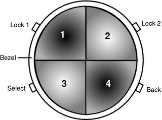
I'd also recommend a 'lock/unlock' feature to avoid the situation where the user accidentally activates some of these buttons or the rotating bezel. A suitable sugggestion for this may be to squeeze two buttons mounted on either side of the bezel to trigger the lock on or off as this is an easy operation for anyone with
their finger and thumb, but hard to do accidentally.

Here is my first suggestion for a watch interface:


There are some points to be made about its features:

  • The select button is positioned so that for most users who will be wearing the watch on their left wrist, their right thumb is already going to be very near the select button once they've finished rotating the bezel with their right hand. The functions of these buttons could be swapped in software in the case of a left-handed user or one who wears their watch on their right wrist.
  • The back button is positioned on the opposite side of the watch for intuitiveness (it's the opposite of selecting a menu item).
  • Buttons 1 and 4 are bevelled inwards into the face. Buttons 2 and 3 are bevelled outwards and raised. This will enable the user to determine which button is which by touch.


Suggested functions for the four buttons are as follows:

  1. Speak the time. This is a common and important feature on watches for visually impaired users. The audio ouput could be either to the headset device, or to a speaker elsewhere in the watch face.
  2. Directional guidance (inside supermarkets etc) on/off toggle switch.
  3. Unknown (input from other team members required!)
  4. User-definable. This button could be attached to any menu item the user regularly needs to access, as a shortcut.


Rotating the bezel should automatically put the watch into 'menu selection' mode and read out current menu items when the user stops rotating the bezel.

Future research work with this prototype on the target audience will hopefully enable us to decide whether these are suitable functions and indeed if this is a suitable watch face layout at all.

Smart watch - directional guidance

One of the principal features of the watch is its ability to guide the user around the environment using tactile responses rather than slow and cumbersome voice prompts (although this will still be an option through the connected headset).

Talking with Mike Sharkey, our resident visual impairment expert, we discovered that any tactile guidance system must be discrete and easy to ignore if the user desires more control. Also, as per earlier posts, we won't be able to deal with object avoidance or other primary guidance due to being unable to determine features such as the slope or texture of the ground. These functions will still be left entirely in the user's control with their cane or guide dog.

Instead we will concentrate solely on 2D directional guidance for the user around a complex environment such as a supermarket's aisles.

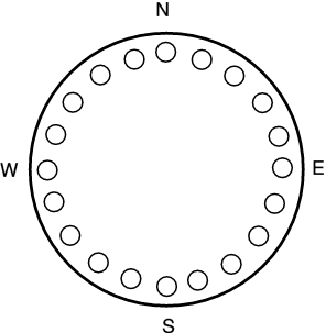
The back face of the watch will have a ring of pressure pins, so that the strap of the watch holds them against the user's skin. If the brain of the system, using GPS location, has decided that the user needs to turn in a certain direction then different pins around the ring will activate to put a slight pressure on the user's wrist and inform them of the direction to turn in. The pins can be analagous to the points and subdivisions of a magnetic compass.


So if the user needs to make a 90 degree turn left then the three pins around the W end of the ring will activate (three pins are used to give greater width of the area of skin activated otherwise the user may miss instructions). As the user turns left, the activated pins move around the ring until the three around N are activated. At this point the user is facing in the right direction and the pins will deactivate (so as not to numb the skin through overuse). If the user strays off course, more pins are activated until they are facing in the right direction again.

Of course all of this functionality must be able to be turned off easily by the user. The ability to do this will come in a later post.

Auxilary Components Pt2

When using the interior navigation system for supermarkets, the navigation aid provides only basic infomation such as aisle location, and infomation like "You are now at the baked beans section" is provided, But this because this system operates on a less than totaly accurate location system it cannot provide detail information about individual types of products at a location ie Heinz vs HP beans. To get around this some form of short range identification device that can connect to the navigation system was needed.

Initially RF tagging, was considered but this was outright deemed too expensive and problamatic because of the close proximity.

After some discussion it was realised that there was a system already in place that could deal with this problem, in the form of a barcode scanner. Which only adaption that would be required was the conversion from text output to audio output which could be handled by the device brain. The only really major issue here was data storage of the information regarding every product, as a business is not likely to reveal this information in any easily accessible form because of a competition, the barcode reader would have to be able to accept some form of seperate data storage device, which could be given out by staff when visiting a store then returned at the end of the visit, idealy flash memory is best for this type of data transfer. This also gives the advantage of the device been designed primarily for our system and been generic at the same time.

Auxilary Components

Two of the components of the system that have been discussed in passing during out group development discussions, but not really directly referenced in our blogging, are the Head set device, which is quite essential to the audio component of the device brains and infomation retreival, And the barcode reader for instore identification of products and uploading of data to the.

Both systems already exist with some generic designs so very little adaptation to the needs of our target user group is needed in the overall design.

Firstly the headset design, with the recent explosion of bluetooth capable communication devices there has been a great influx of new headset designs moving away from the large bulky RF/IR wireless headsets and the more standard wired inner earphones and over ear headphones. While classic inner ear headphone and earpiece's were part of our early concept's for the device, After gathering info from the target user group it was realised that idealy the user's hearing should not be impaired if at all possible. Initial thought was to use a system similar to noise canceling headsets, but this was deemed too bulky and after more discussion, deemed not to provide the level of hearing accuracy needed for the target group. The Second concept of a headset design that came up in discussion was similar in design to current bluetooth mobile headsets, as the ergonomic's of there design fit quite nicely into the requirments of our users and is easily adapted to fit the needs for the product.

More Specifically the headset consists of, a generic mobile bluetooth headset.(we will be using blue tooth and device pairing for general connectivity of the devices components and it is ideal for short range data communication). This is then cut down by removing the mic component as this is not needed in our design, though if used in conjuction with a mobile phone it might be pertinent to retain it. The basic design of the the remaining ear piece is then changed to suit the need of not directly impairing the users hearing, this is acheived by moving the audio output (speaker) compont of the earpiece forward and away from the surface of the ear allowing clear passage of normal sound. The audio output is then orientated in relation to how the headset is worn, to project sound into the ear cavity from its new position. Directed sound projection will allow for the user to hear output while, not been loud enough to damage hearing or for other to be aware of any noise emmission

Friday, February 17, 2006

The brain again - The bits I missed out...

Ok this is a post to finish off what the unit I described does and to bring to the world all the proposed features and uses of our device, some of this post will touch and cover stuff we have already said, other bits will cover new ground.

As can be seen by the posts, our device is intended to be a electronic guide for the blind, the device is designed to work in tandem with current blind motion helper devices (guide dogs and walking canes) and to replace current human guidance to/from places and around places (such as supermarkets).

In the outside world (outside of buildings) the device will guide people to locations using GPS such as already mentioned GPS services, this will be a precise as previously mentioned. A later post with the smart watch will explain how the system gets its route destination information. For now all I need to say is the system will guide the user to that location and inform them when they are there.

Other features the system will have in the outside world will be the ability for the device to interact with traffic lights. Currently some UK traffic light controlled pedestrian crossings (called Puffin crossings) include a device on the bottom of the user input/output unit which turns when the pedestrians can cross and even though this is a good feature it has several limitations:

  • Firstly, its distribution, only recently have Puffin crossings been introduced and there is no wide scale upgrade plans nor requirements to do so for current pedestrian systems and as such almost none of these traffic lights are available, for example, almost the only one you will find in the vicinity of the university is at the Selly Oak station car park crossing.
  • Second, these devices can only work with one such user at a time, this may not cause many issues but this can cause them still
  • This system is very vunerable to vandalism, especially as more people discover the new features of these sorts of pedestrian crossings
With our a device, a unit could be placed at the top of the traffic light (or each side of the road) such that anyone within a 2-3 metre square area of the device will be informed by the traffic light that the button has been pressed and that they should wait. This system could then monitor all Via devices that stay within its area whilst waiting for the system to go green (this gets rid of the issue of people walking past the lights) and inform them once the man goes green at which point it can monitor their progress over the road in pretty much the same way the current Puffin system does except using the Via device instead of its own infrared system.

In the internal world (indoors) the system will guide users around using a local gps system inside the building. The discussion of the smart watch will focus on how this works and its features. What I am going to talk about here is a feature we have left out for a while. In emergencies in these buildings (when the fire alarm starts), using the internal GPS the store system and Via can guide users to safety (safety being the their nearest fire exit).

Though the brain is a very important part of the product, it will not be the products sole component, the other component necessary will be blogged about in detail very soon but here I will discuss them briefly:

  • Smart Watch - This will communicate with the brain using Bluetooth or something similar and will inform the brain of the users input. On its back (pressed against the users skin) will be a system that helps direct the user as an alternative to being narrated to.
  • Headset - This will be designed to allow users to hear the outside world whilst receiving information from the brain, again this will be based on Bluetooth or something similar. Unlike the brain and Smart Watch, the headset will not be a compulsory unit because as some blind users are also partially deaf, for those with an induction loop system they can set their loop to the T position and the Via brain will communicate with them with a headset.
More posts on these components will follow in the next few days

A design prototype of the brain


Be warned, this picture is not to scale nor actual ergonomic design. I'm afraid I lack the ability and the money to afford the software to achieve a more realistic prototype picture so the GIMP will have to suffice!

The picture has explanations of various features I think are necessary. This is as far as I am going to take this tonight, I will comment more when my brain starts functioning again, sometime tomorrow.

P.S. The bigger version is available on my server (look at the links to find a route to it)

P.S.S Where I say 'Standard Batteries' I mean the devices standard batteries which will probably be Li-ion based.

P.S.S.S edit by Mark: here are photos of the comparably-sized Nokia 2650 to give you some idea of the dimensions of the brain device.

Thursday, February 16, 2006

More detail on the iPod-style navigation

The iPod is renowned for its stylish looks and good attention to design and usability principles. Most menu navigation is performed using the 'click wheel', until recently designed by Synaptics who also make the touchpads in many laptop computers and based on the principle of these touchpads but with movement in only one dimension (a circle which can be rotated in either direction).

This translates well to the possible idea of a rotating bezel around the face of a watch. The idea is that rotation of the bezel or click wheel is equivalent to scrolling up or down a menu depending on which direction you rotate in. Clicking a physical button, rather like a laptop touchpad mouse button, allows the user to select the current menu item. It's intuitive and relatively easy to pick up.

An older equivalent is the Nokia 7110 and its Navi™ roller, which scrolls up and down and clicks like a wheel mouse. However this was designed primarily for WAP browsing and once this had flopped, the Navi™ roller was dropped too.

Clearly for blind users some changes will have to be made. The 'select' button will have to become raised out of the profile of the watch face (much like the 3rd and 4th generation iPods before the 5th generation flattened the button). We may want more than one button on the watch face as well, each dedicated to one specific function in addition to the single dedicated menu select button, as relying on delving inside menus for commonly-accessed features will not be desirable for any user let alone one who can't see what menu they're on.

Names of menu items will need to be spoken. Current blind talking watches do this well with a loud speaker on the watch face, which can easily be moved nearer to the user's ear in a noisy environment if the user is having difficulty hearing, simply by raising the wrist.

Obviously the user will not want to spend 30 seconds scrolling through each menu and having each item spoken to them one at a time as they scroll through. My suggestion is that as the user scrolls the menu selection changes proportionally to the amount of scrolling done by the bezel. The bezel should click each time a menu item is transitioned to give some idea of progress through the menu.

People are quite capable of memorising the approximate layout of a menu given practice. Nokia phone menus are a good example of this, and a good converse example is Microsoft Office with its irritating collapsing self-reorganising menus (an old HCI post of mine) so it's reasonable to expect a user, after using the device long enough to be familiar with it, to be able to locate menu items in terms of 'numbers of clicks' or, more likely, just scrolling the bezel approximately one quarter of the way around clockwise (for example) to where they remember the desired menu item being.

Only once the user has stopped scrolling (indicated by a pause of eg. half a second) should the current menu item be spoken. The user can then press the 'select' button to confirm, or continue scrolling knowing that the desired menu item may be just a couple of clicks away from where they thought they are.

Any comments on this idea? Leave them after this post. Then we'll have to come up with some suggested designs for the watch face incorporating all this if we can get a workable consensus on the design.

iPod sources: http://en.wikipedia.org/wiki/Click_wheel#iPod

'The Brain' - In more detail

Ok, this post is going to be dedicated to the device that will act as the brains of the device, the one where we mentioned Monday will be similar to my Nokia 2650.

First off, its aesthetics. As per the Monday post, this device must be of similar dimensions to a clam shell phone, so the following size and weight criteria apply as maximums:
  • The unit must be no more than 90mm long, 50 mm wide and 25mm high
  • The unit must not weigh more than 100g (But this may need to be sacrificed in the light of necessary power versus usable time, this will become apparent as you read this post)
So why these restrictions? Well its important that the device easily fit into the majority of pockets or a handbag, etc because the device needs to be something the user can keep with them at all times without it getting in the way of their lives and it also needs to be 'forgotten' so using a phone as a base ideology suits this perfectly. Of course, leaving it in a handbag maybe a bad idea as it requires being with the person in order to guide them to the device needs to be able to dropped into a pod that can be attached to a belt or clipped onto some item of clothing, perhaps it should come with its own belt to be wrap around the waist in a similar fashion to a bum bag.

This requirement for it to be similar to a phone gives rise to the need for it to be shaped ergonomically (on the outside) with no sharp edges so that it doesn't hurt the user, it also needs to shaped so that it can be used with the additional accessory pod (perhaps the term 'cradle' is better). It needs to be made of a durable, light material but in the case of an accident it must cause no or almost no injury to the user.

It needs to run off a battery with a relatively good usage time, preferably a day or two and the battery needs to be in a compartment that can be easily accessed for battery changing, just in case the user can't charge the battery, they can at least carry spares. Having a battery compartment means we need to take special care designing a battery which allows blind users to quickly change the battery unaided and without getting it wrong first time! So the battery needs to be shaped so that it only goes in one way around and side around (unless both sides of the battery have contacts!). I think here, for ease, the battery and its compartment casing should be one unit, similar to how it used to be with older phones before the introduction of separate backs to shave pennies off the production costs.

The unit will need plenty of storage to store the software that contains the voice system, gps client, cache of stores contents when you walk through the door (maybe) and such. The storage would need to be permanent and non-volatile (i.e shock proof and not need constant power to keep it 'remembered'). Hard drives are ruled out by the shock proof factor and weight factor so the best option would be NAND Flash memory which is shock proof and non-volatile. This is used by many devices currently such as USB sticks and the iPod Nano because of its non-volatile benefits over hard drives and its speed and power consumption benefits over CMOS memory. Currently the product has storage capacities form 256MB to 8GB (from Micron) and this will more than likely increase with time and the device can obviously have more than one chip.

On top of this memory, the system will need DRAM random access memory because flash memory (and hard drives) are not very fast access and as the device will be working in real-time access speeds need to be kept to a minimum. A 512MB to 1GB DRAM with a clock latency (delay) of 2 to 2.5 ms should be fine.

Of course, all of this needs a brain...a quick look around current GPS PDA's has shown that the Intel Xscale 200 MHz ARM processor is currently more than sufficient for GPS/PDA devices but I feel with all the features of our device it will require more than this but the Xscale chip has excellent power and heat efficiency, so we'll keep to that. We can either double the processor to 400MHz (using the Intel PXA255) but I feel that the real time element will require more than this so I think the 624 MHz Intel PXA27x family will be much more useful.

As for the GPS side of things (GPS will make up the building and outside world navigation) this can be based on the core internal components of almost any GPS system, like the following.

The unit will also need a Personal Area Network technology to communicate with the headset and smart watch, some thing like a box standard Bluetooth would work here.

As far as software goes, the device could either use something like Windows Mobile or Symbian OS or some custom form of Linux depending on best performance and compatibility with software development for the various components of the device. More on the devices software for its features later.

Apologies for the lack of posts...

...But we have been busy! Today I will try and explain in more detail some of our planned device design, most of what I will post will have already been discussed by the group, hopefully in the next few days we can fully cover all the components of the project!

Monday, February 13, 2006

Device prototype specifications

After many discussions we have bargained our way down to what the device should and shouldn't do.

We have a problem with research in that we can't ask a vast target audience. It's fair to say that we have a very small market. The difficult thing is we can't just go out and build a haphazard online questionnaire as we'd need the entire target group to be able and willing to access it on their computers - not such an easy assumption to make with blind people as the target! So any feedback will need to be obtained manually by ourselves.

We're looking at having two different working environments. Both are very similar to each other but with different requirements for features such as accuracy of information.

  1. Outdoor world navigation and location information
  2. Indoor navigation and information eg. in a supermarket or theatre


The outdoors environment is very similar to what is currently available through GPS navigation devices. Its route planning/navigation systems are similar to current car route planners such as TomTom: Relatively low accuracy (metre-resolution) although our target accuracy would be to at least get the user to the right door of a street or outside the desired shop entrance. This would require slightly greater resolution than that currently available, in the range of half-metres.

The new Galileo GPS system currently in testing will provide the desired resolution.

Another use will be for feedback about current statuses of traffic lights at pedestrian crossings. There will be another post about this later.

Indoor environments such as in a supermarket will allow the user to obtain high resolution locational information about their surroundings such as the route to a particular aisle with the desired shopping items, or locating a seat in the theatre. This will be done using a localised GPS system installed inside the buliding due to the much higher accuracy of locational information required (10s of centimetres), which current and near-future space-based GPS systems are unlikely to achieve.

There will be up to three parts of the device depending on the user's needs:

  1. The main processing part, which will have dimensions no larger than (for the sake of something easy to visualise and photograph) Dan's Nokia 2650. The weight is about 100 grammes max. which we feel to be reasonable. More information about its features and photographs of the similar-sized phone will appear in a later post.
  2. The input device, based on a 'smart watch'. The front is a standard blind/partially-sighted user's watch with a button for a speaker to speak the time and a bezel ring around the outside for control of the guidance functions, similar to an iPod control ring, with a small number of further buttons on the 'face' for selection and menu navigation. The back plate contains a ring of pressure actuators for directional guidance. More information, schematic diagrams and 'screenshots' in a later post.
  3. The headset for voice output. This will connect to the main processing device using Bluetooth or similar technology and enable voice feedback on menu prompts from the device. Importantly for a blind user who relies on their hearing much more than a sighted user, hearing of the outside world must not be obstructed by the headset so a device that sits just off the ear and permits external sound to pass through is essential. More designs and information to follow.


NB: This post was made during a meeting with all three of us contributing to its contents